 For years Human Computer Interaction (HCI) has been a science that has captivated the technology market, with implementation in its simplest forms as textual menus and product aesthetics to more complex designs in mobile phones and computer systems to unify the bond between man and machine. Interfacing the user can often be a difficult venture to undertake, yet it is paramount in many design phases prior to the actual layout completion, as concept cannot truly be imagined without the implementation of an interface guideline. Many products and digital media are plagued with the problems of human interaction, yet there are some who simply always get it right. We all remember the days when we would curse our phones for not doing what we wanted or lost our patience when we couldn’t work out how to use a piece of software. Well many would argue that this is a human error, which at times is true, but often it can boil down to the interfacing of the medium you are using.
The HCI concept?
Looking at the HCI concept in its simplest form would be in the media that we see every day, advertisements and movies even the newspapers and magazines we read. All of these have an element of interfacing designed into their layout. What are you on about I hear you say, well the theory behind it is simple. Before you can design a (for want of a better word) perfect medium, may it be a newspaper or magazine, you must first understand the demographic you are aiming at. With this in mind you will then be able to understand the needs of that market collective. Examples of textual interfacing are reading from left to right, correct use of colours and consistent fonts, even the position of images on the page. All of these are down to the implementation of an interface rule throughout the design phase.
The human element:
In technology today computer systems and machinery still rely partly on the human element, which is where the HCI guidelines come into play. Software is a clear example of a need for such rules as without them the user would not have any idea of how to perform the desired task. To a degree we can see that the digital and computer age is taking over the hands on approach and some would argue that this is a bad thing. Personally I can appreciate both sides of the story, yet albeit a biased view, I am on the side of technology. I am excited for the advancements we have made and look forward to the next big thing. We all spent time as a child wondering what it would be like to go into space or standing in front of the electronics store drooling over the new gadgets. Well if it was not for the advancements in technology then we would not have all of the so called “Mod Cons” of today. Anyway I am getting off point…
HCI in the software industry:
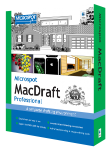
 As mentioned before HCI is required in the software industry and has proven to be a huge factor in its design. Like I said it is important you understand the user you are aiming at, let’s use an Architect as an example. Before the age of Computer Aided Design (CAD) software, all Architects and Drafters would do their drawings by hand. Personal experience has shown that trying to learn a new way to do something, after you have spent years perfecting it, can be next to impossible, it is at this point that the designer must realise his first need. The Market has been cornered by certain CAD software brands an example of which is Microspot MacDraft, yet there are some that offer much cleaner interfacing rules than others. A drafting expert of 20 years needs to be able perform the same task on a computer in the same amount of time (if not faster) than by hand, for the changeover to be worth it. This is a conflict that has been a bane in my design career and as proven to beat me at times. I have worked on interfacing many different mediums, yet the one that has intrigued me the most is the software industry.
Using HCI studies:
The key thing to remember when trying to generate a concept is that everything has an interface; everything relies on the user knowing what they are meant to be doing. I often ask the question “would I be happy to use this” which is actually an easy question to ask, it’s the answer that can prove to be a problem. To summarise my interpretation of the continued battle between man and machine, HCI is a concept that is to be embraced and respected. As the designers of today it is our job to take the industry to the next level and try to perfect the mistakes of the past and create a true union of opposites between man and machine. I leave you with idea that anybody can draw a shape, yet it takes imagination to be able to make it interesting… Why not give it a go yourself with Microspot MacDraft Professional, a 2D drafting, technical illustration and layout application for the mac.


